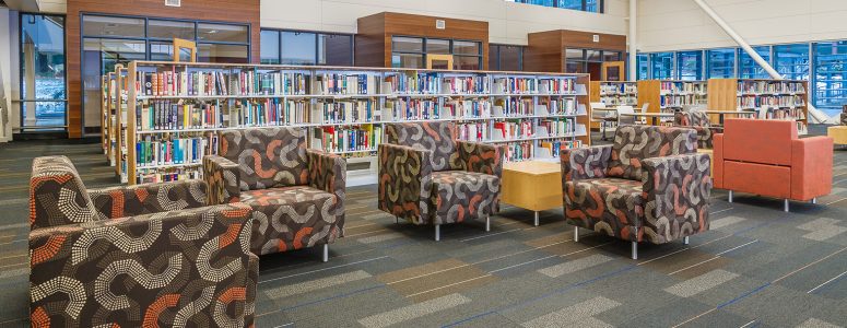
Libraries are an integral part of society. Providing the resources and spaces for students to study and prepare for their futures and supplying free access to technology and literature in their community are just a couple ways that libraries make a difference every single day.
But within recent years, like many public spaces, libraries have had to navigate the changes occurring in our world.
From learning how to leverage digital access to resources, removing library stacks to provide more communal space, and ensuring that patrons’ wide variety of contemporary needs are met, the changes have been both crucial and challenging.
Here at Agati, we’ve been designing furniture for public spaces for a long time. Our team consistently sees some incredible examples of libraries prioritizing contemporary design. And we particularly love seeing libraries prepare for the future by creating a space that delivers inspiration and promotes productivity.
So we took a few minutes to compile a few projects we’ve had the opportunity to work on that are great examples of effective, contemporary design. We hope these projects help stir up ideas for solutions in your own space!
Here are 5 inspirational examples of modern library design:
College of Idaho
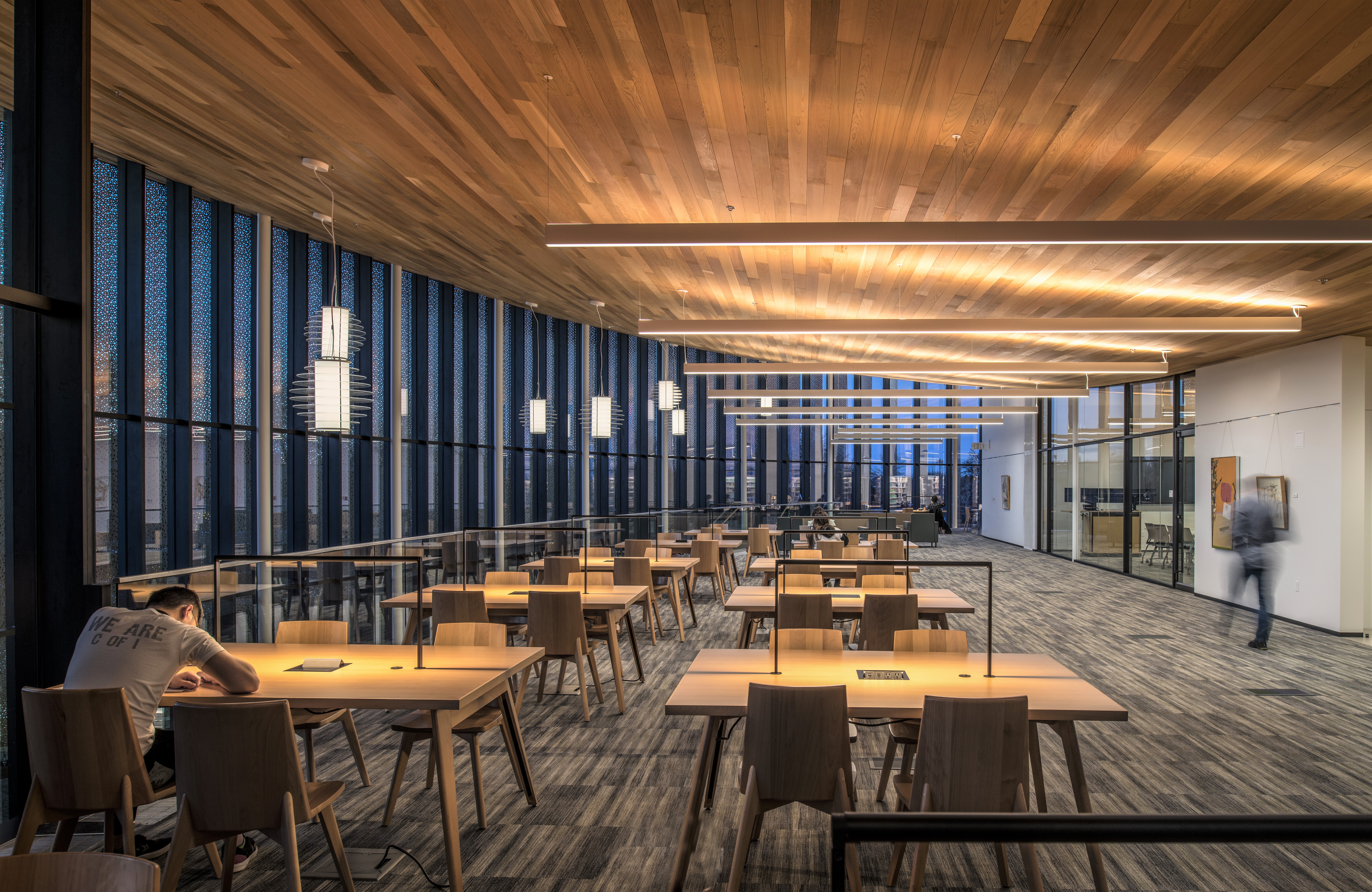
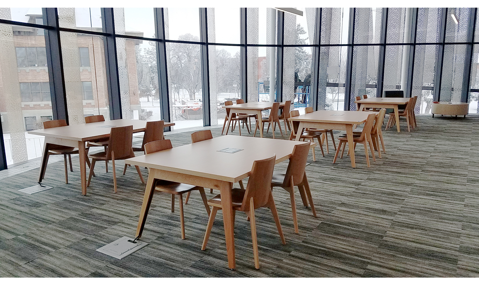
Overview: We recently worked with the College of Idaho in Caldwell, ID to provide the best table and seating options in their new Cruzen-Murray Library. We loved being part of this project and are proud of how it both looks and feels.
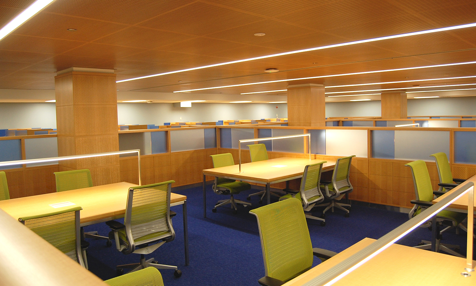
Why it Works: After discussing their needs, they decided to go with our Etta collection to support the modern feel of the library while providing students adequate space to study and collaborate. Beyond aesthetic, incorporating power access and a mounted light into each of the tables ensures a solid user experience and years ahead for this space to be utilized.
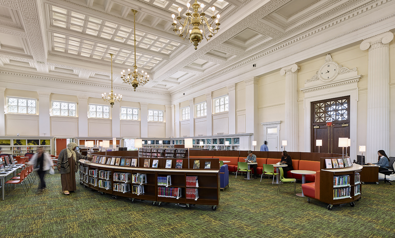
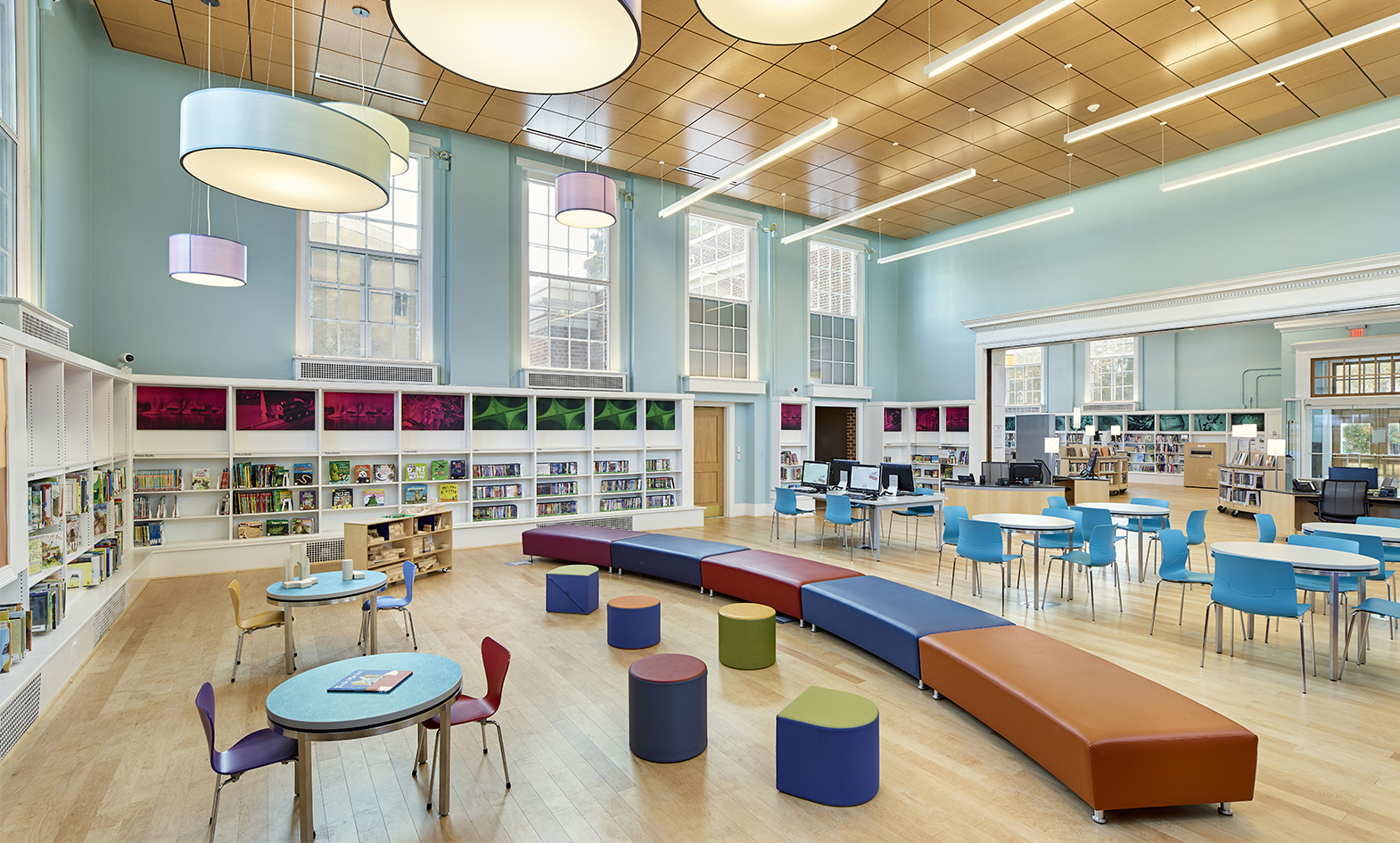
Free Library of Philadelphia
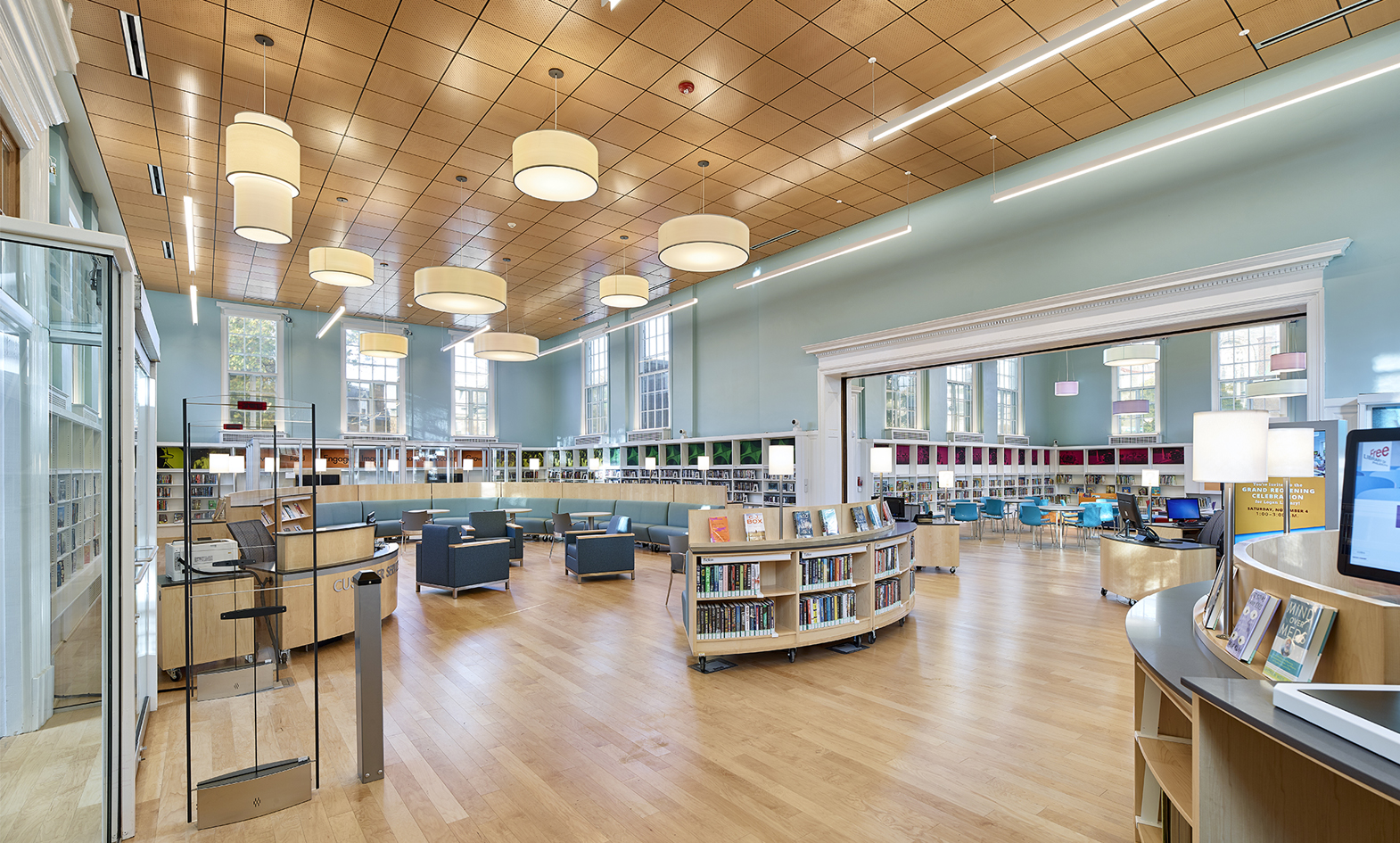
Overview: We had the opportunity to work with the FLP Library system to update their Tacony, Marrero, Lovett, and Logan branches. Every now and again, a public library project comes along that, when it ends, feels like we have accomplished something truly spectacular. This was one of those projects.
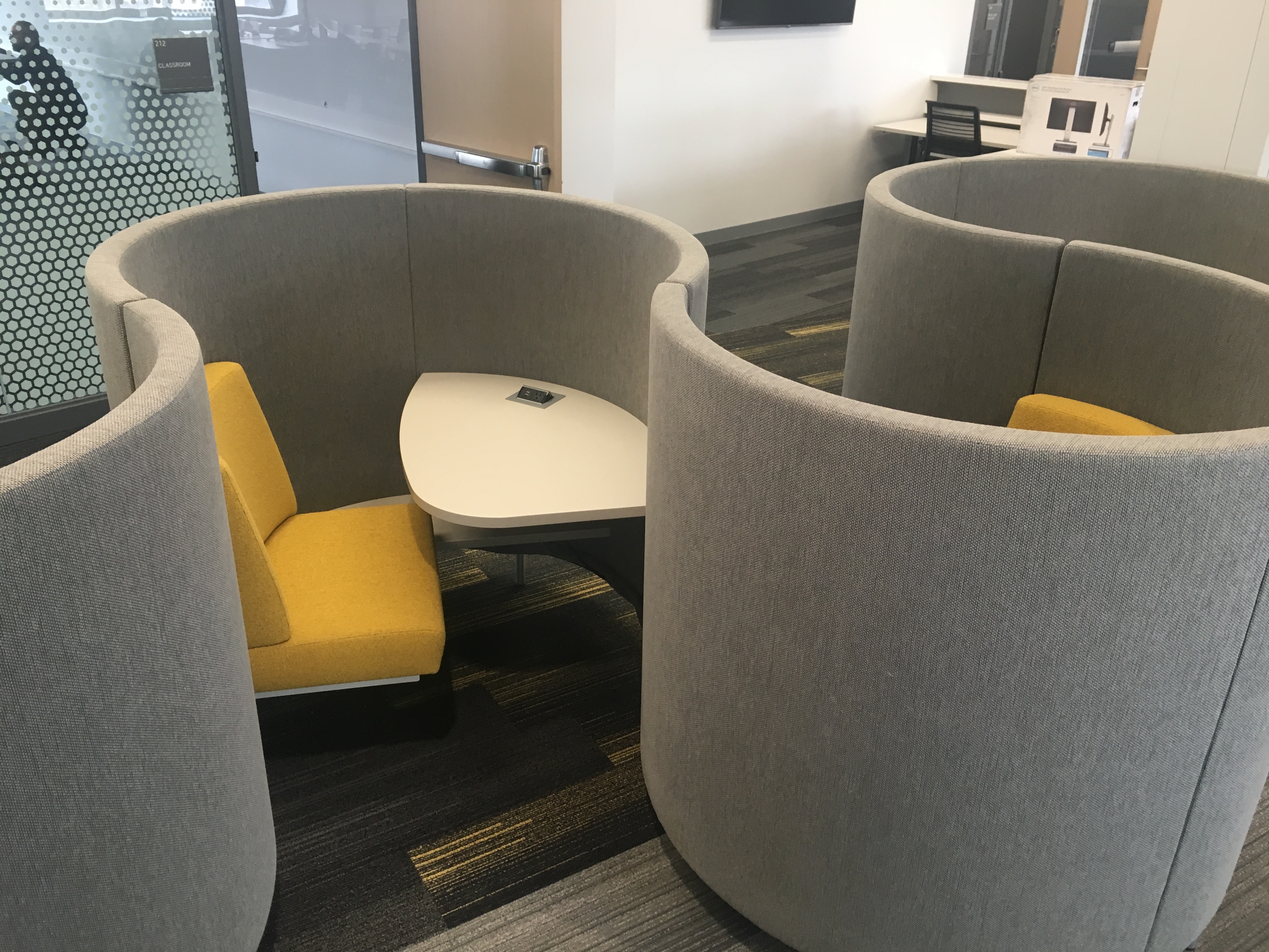
Why it Works: This redesign works primarily because the FLP Libraries and the project architects worked hard to design each branch to meet the needs of their specific community. By prioritizing user needs, conducting patron surveys, and integrating digital preparedness, they created a space that, plain and simple, just works really well. Knowing your community is key! Want to learn more about their design process for this project? Read our in-depth interview with Jim Keller, Library Architect.
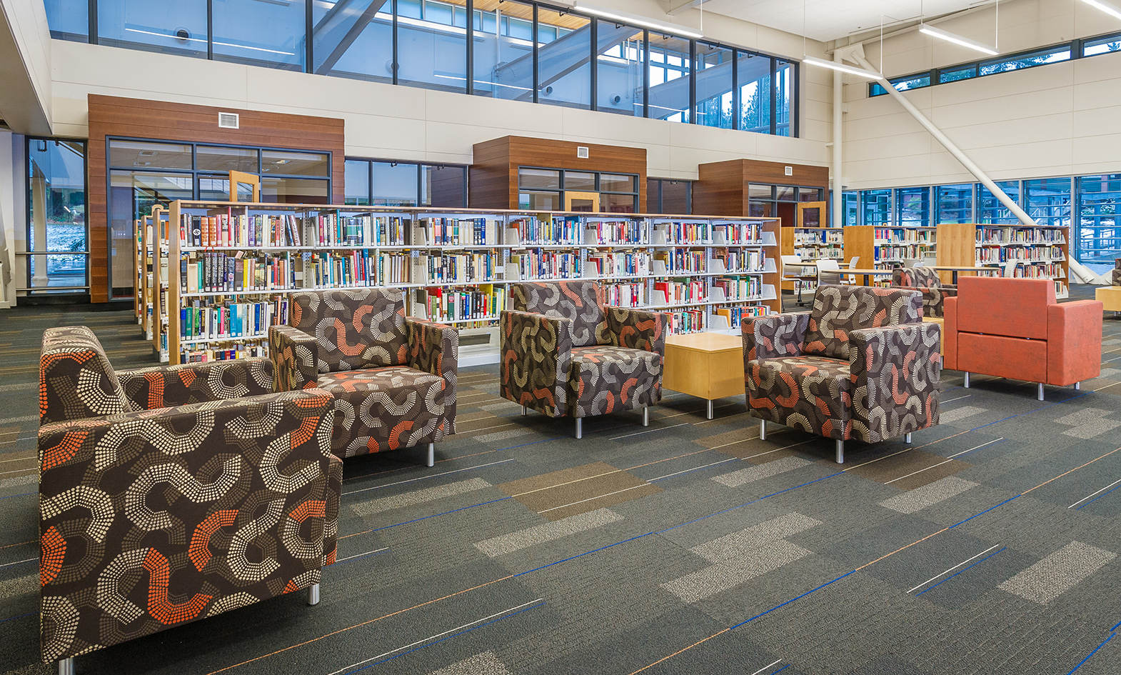
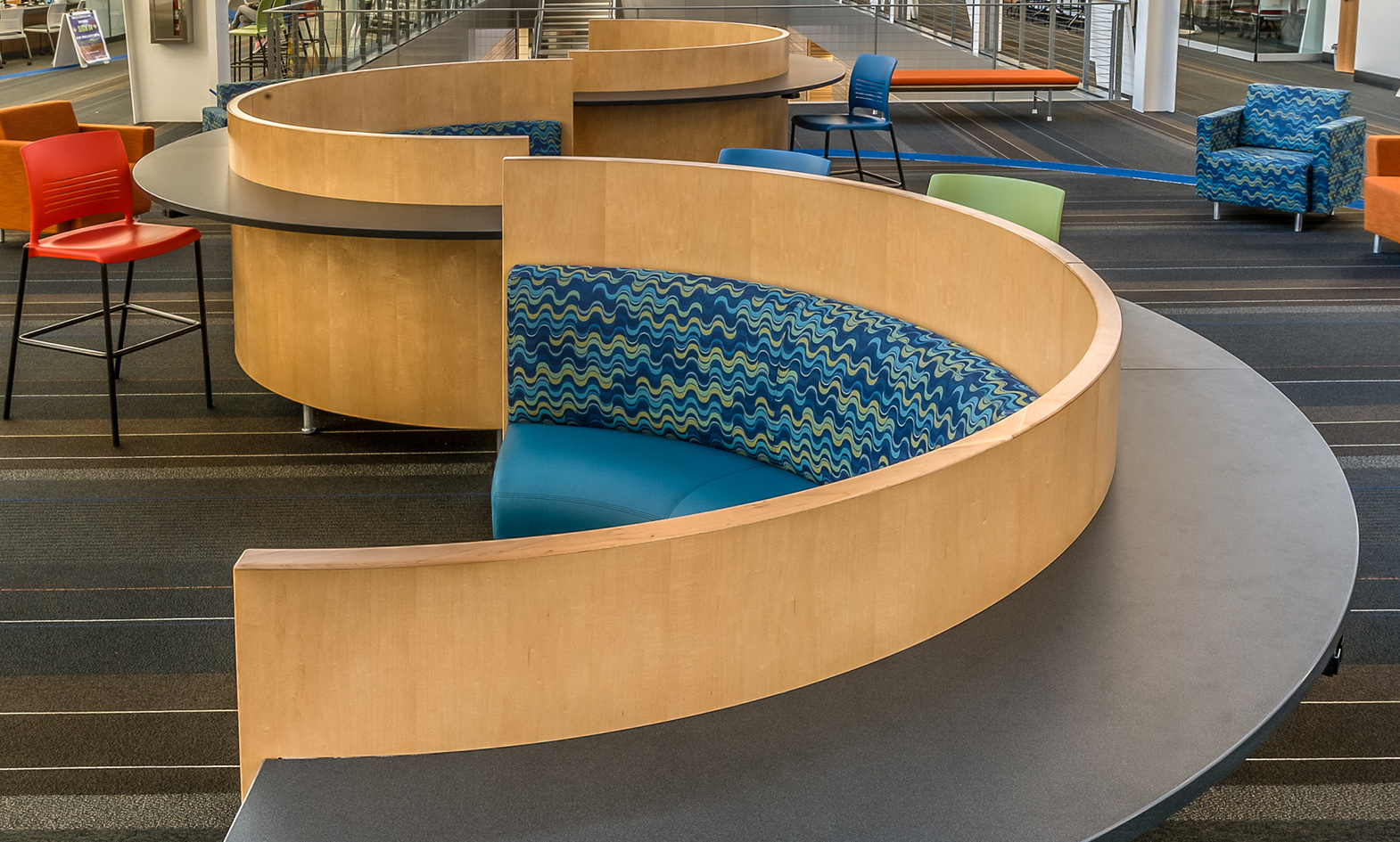
South Puget Sound Community College
Overview: We partnered with South Puget Sound Community College to refurnish their library and provide diverse furniture options for their students to utilize.
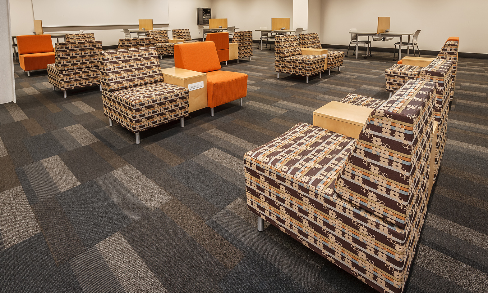
Why it Works: Options are what set this space apart. Specifically, what we love about this space is the balance between individual and collaborative workspace that’s provided. Featuring our Gee Chair, Hampton Banquette, and Manifest Benching System, the design team did a great job of understanding their students’ needs and were intentional to support multiple work/study patterns. Additionally, despite the more “open” feel to the space, options for focused, individual study are provided by utilizing dividers at the workstations.
New York University
Overview: The design team at New York University worked with our team to furnish a focused study space for individual and group projects.
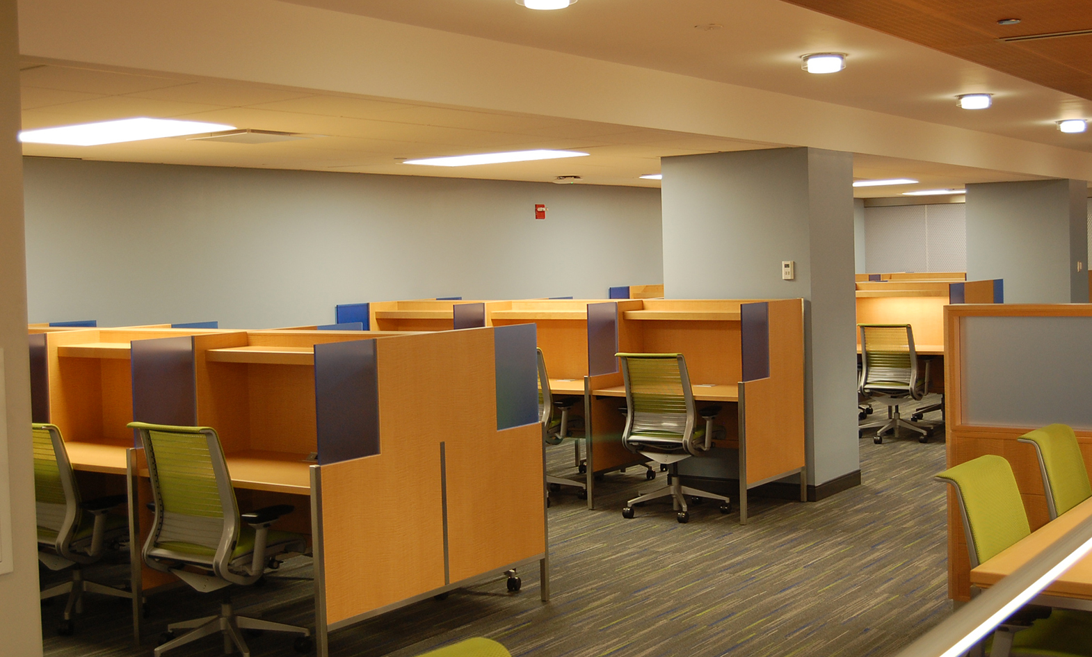
Why it Works: We love this space for it’s clarity. It’s obvious what it’s meant for and communicates that clearly through the furniture available. Utilizing our Roland collection, the team at NYU were successful in developing an area with adequate options for individual study through private study carrels. However, to add interest and options to the space, we utilized the center area of the room with open tables for optional collaborative work or for study that requires a larger surface area. Aesthetically, the feel of the furniture supports the university’s emphasis on research and in-depth study.
University of Iowa Gerdin Athletic Learning Center
Furniture options are a key aspect of any library’s efforts to secure their place in a world that’s constantly changing. From aesthetic to durability, the quality and intention of what makes up your space determine the effectiveness of the facility.
We hope these projects have inspired you to think through what’s available in your own space, and excite you about the mission you’re on within your community!
FREE RESOURCE:
Whether it’s a full or partial redesign, it’s important to know what questions to ask and what to consider. After over 35 years of designing furniture for public spaces, we’ve learned a few things to help make the redesign a success. Download this free resource to learn 5 things to consider before you redesign:
