A big thanks to our friends at White Baux Studio for their significant contribution to this piece and the incredible work they did for the initial College of Idaho design and installation. Check out the recent free webinar we did together right here.
We’ve been talking a lot recently about reopening our buildings (or effectively keeping them open). Whether you’re in a densely-populated community and are early on in those conversations or have been open for months, the challenges exist for all of us. In a recent webinar with White Baux Studio and Library Journal, we discussed WELL design principles that will help you tackle tough space problems related to the pandemic while also making your library healthier for the long haul.
As we were preparing the content for that resource, it got us thinking about setting up an example through a case study. A while back we partnered with White Baux Studio and the incredibly talented team at Richard + Kennedy Architects on the design of the completely-new construction of the Cruzen-Murray Library at the College of Idaho. The Cruzen-Murray Library was a new library built to be a leading example of the twenty-first-century transformation of the library building, and we’re really proud to have played a part in that project.
Today, we’re walking you through a theoretical case study of what makes that space successful and what our recommendations would be to shift that space and get people back to fulfill the goal of reopening.
Here’s that case study interview between Kelly Bauer, Partner at White Baux Studio (NCIDQ, FIIDA) and Joe S. Agati, Director of Design and COO here at Agati Furniture.
When you originally worked on designing and furnishing the Cruzen-Murray Library at the College of Idaho (pre-COVID), what were your goals for the space? What was behind the decisions you made there?
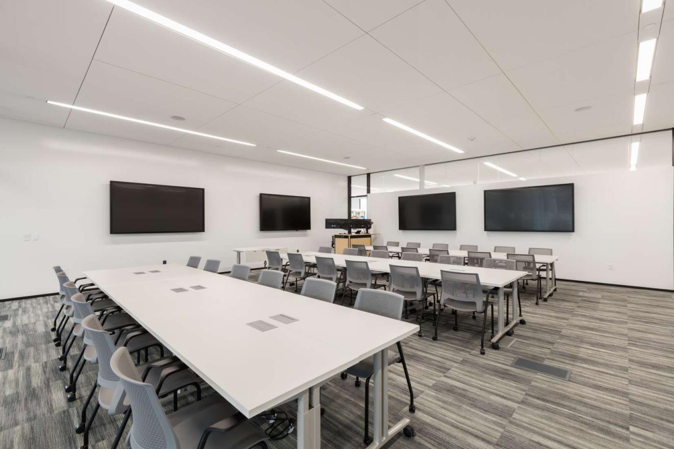
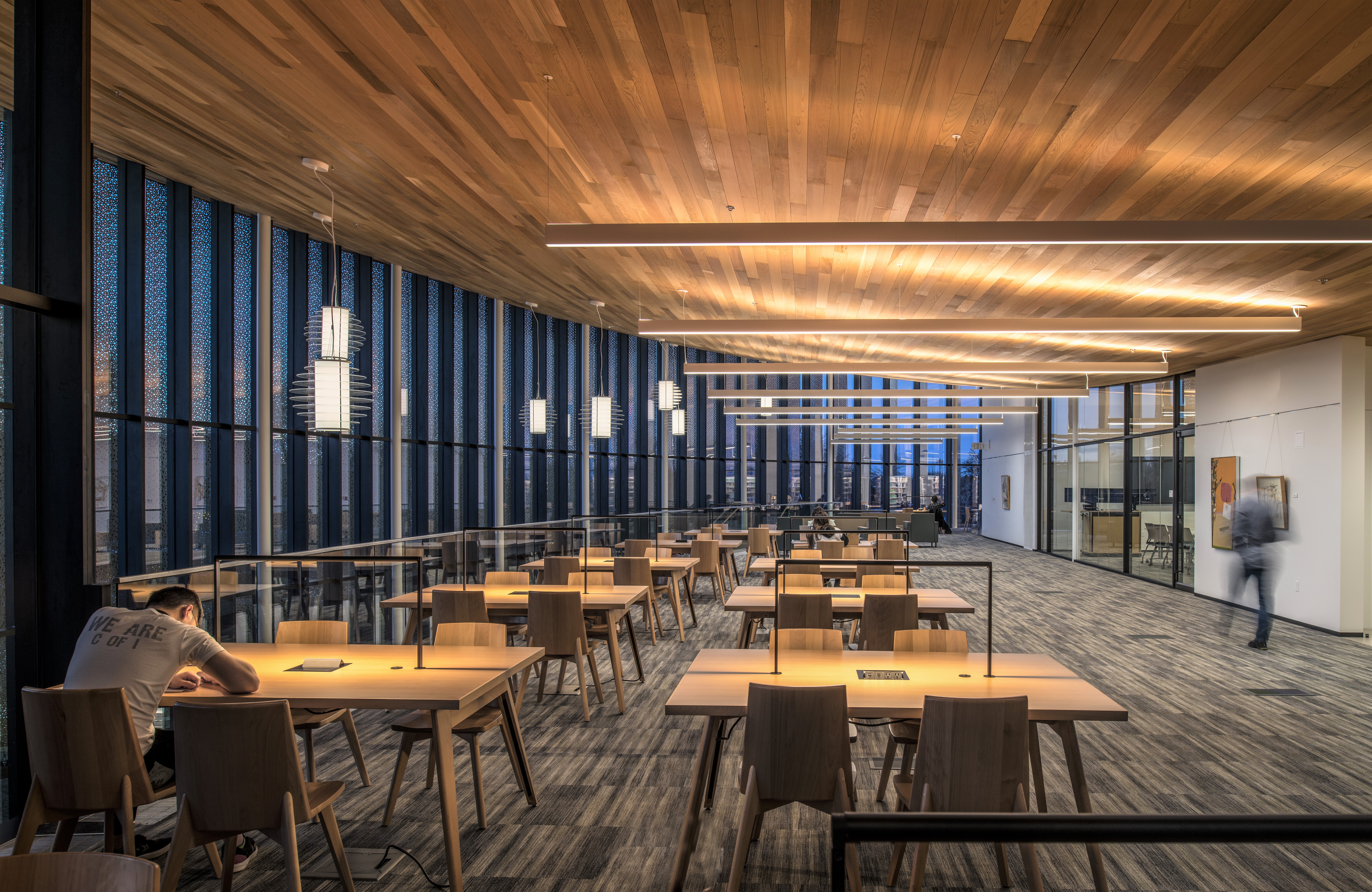
KELLY: The College of Idaho is a great representation of a space that prioritizes the WELL principles, particularly through natural lighting, a flexible raised floor system (HVAC), and plug-and-play capabilities throughout the facilities.
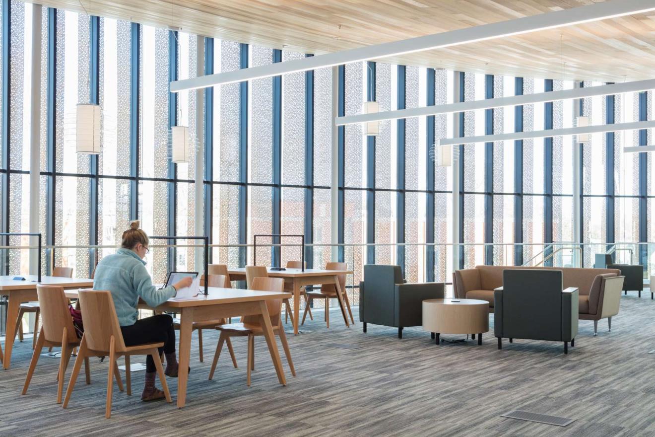
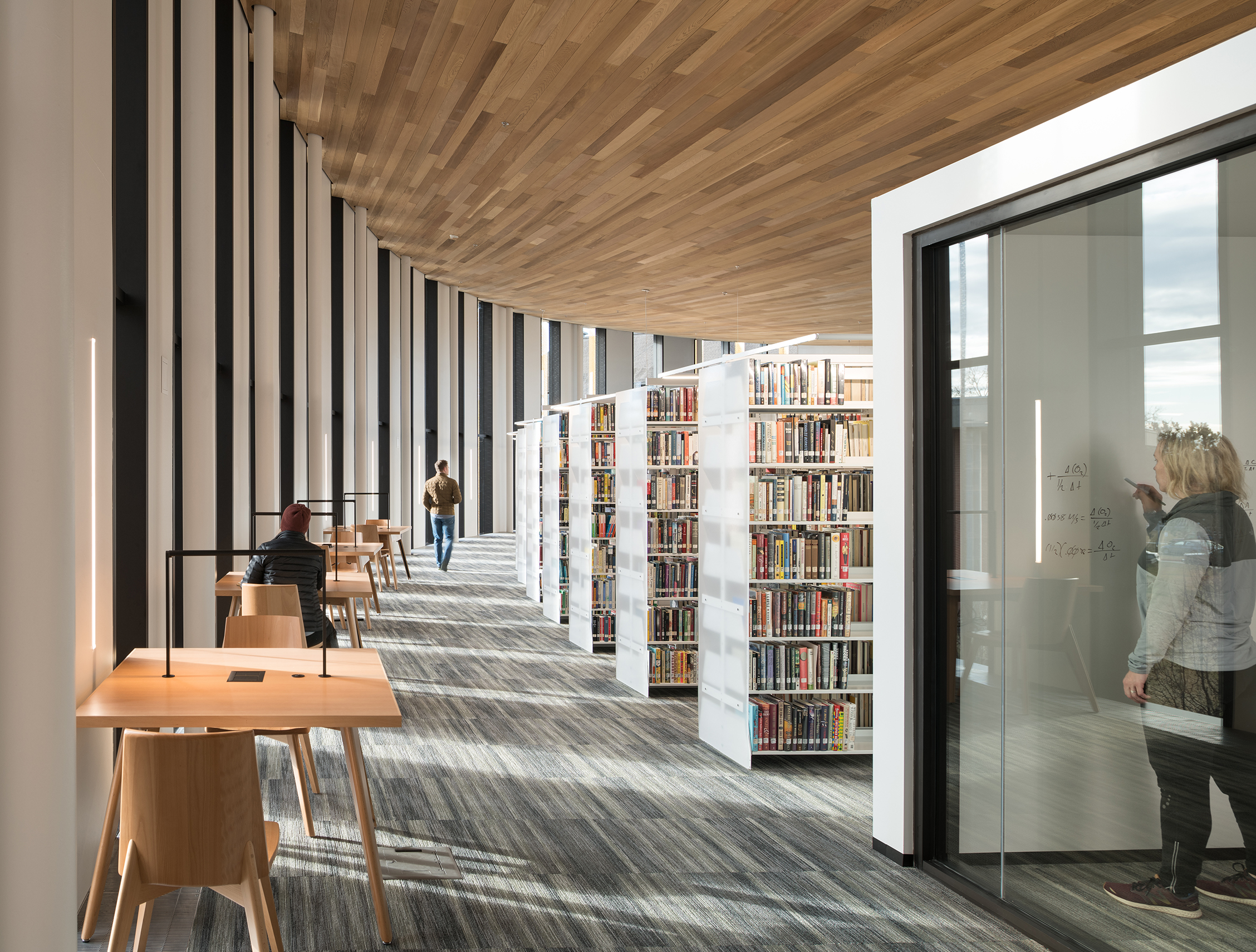
Photo Courtesy: White Baux Studio
As designers, we understand and apply universal design in the spaces we develop. You want to experience equitable access for every aspect of the design – landscapes, building wise by code, and interior furnishings. For the discussion of higher education, our purpose is to create expert learners. Learners need to be comfortable and find it easy to access what they need in the space, be it virtually or in the physical space. The space must regulate and sustain their interest, effort, and persistence in completing their task. The faculty are important in this idea as well… they may need the flexibility to move spaces, to reconfigure, to access technology, all while knowing they have a safe place to work.
For Universal Design for Learning, we approach the design of the building with the following principles in mind:
-Equitable use
-Flexible use
-Simple and Intuitive Use
-Perceptible Information
-Low Tech Options + Technology
-Size & Space Approach + Use (applies to physical + digital use)
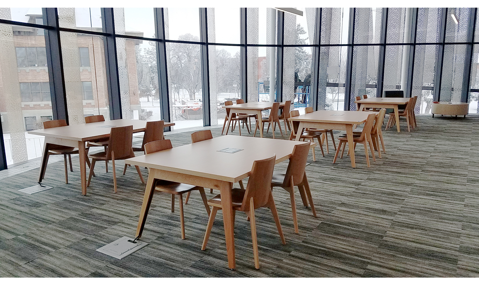
JOE: We loved being part of this project and are proud of how it both looks and feels. After discussing their needs in the beginning stages of the installation, they decided to go with our Etta collection to support the modern feel of the library while providing students adequate space to study and collaborate. Beyond aesthetic, incorporating power access and a mounted light into each of the tables ensures a solid user experience and years ahead for this space to be utilized.
It feels light. It feels open. And it feels like an intentionally curated space for productivity. That’s what we love about it.
Libraries across the country are having to make difficult decisions about how to reopen safely and effectively. If you were to guide the process of reopening the Cruzen-Murray Library, what changes would you likely make?
KELLY: If you look at the floor plan below, the areas highlighted in blue are areas that Joe and I would suggest we move things around.
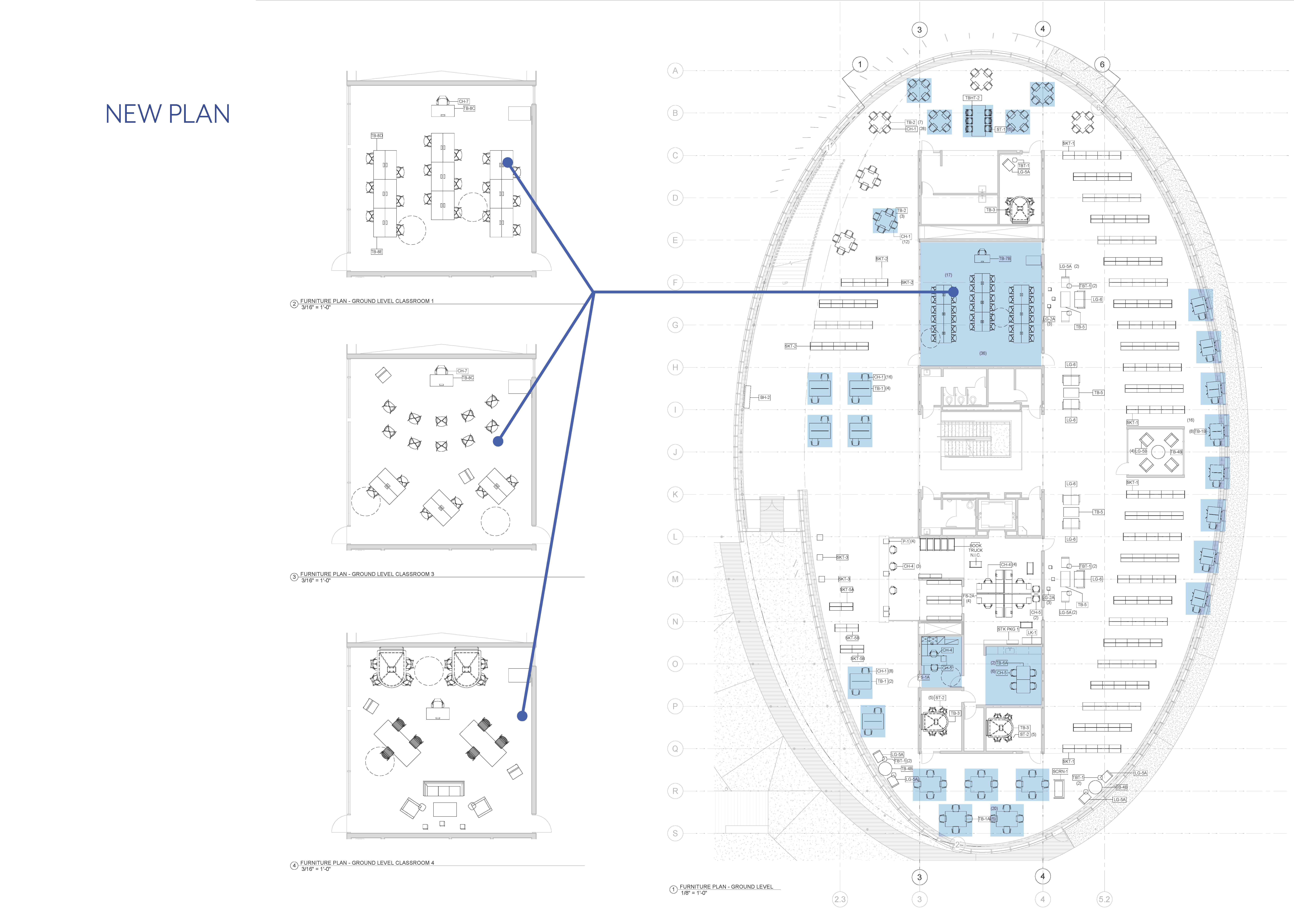
You may notice that we immediately recommend going to a 90-degree layout on the 4-person tables and taking them to 2-person tables. We’re taking seating out in quiet areas to create single-user quiet study tables. And then in some cases, we’re just moving 4-person tables around to offer additional space between seating areas.
In this building in particular, the classrooms are key. On each of the three floors, there are classrooms with a capacity of 36 that utilize benching systems, which we recommend bringing down to 18-person capacity. (Because many universities have had to utilize hybrid models of learning, this is how we anticipate the lower capacity evens out.)
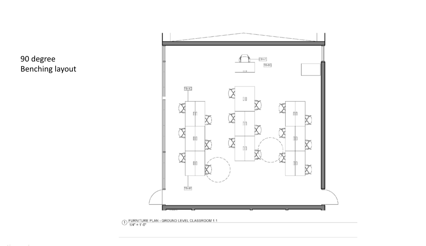
JOE: There are a few primary ways you could rework these classrooms that we discussed. The first option here is to literally just take out half the chairs, putting 3 users on each side of the full benching system in a 90-degree layout. This, of course, would likely be the simplest solution if the classroom will continue to be used in a similar way as it had been prior to any shutdowns:
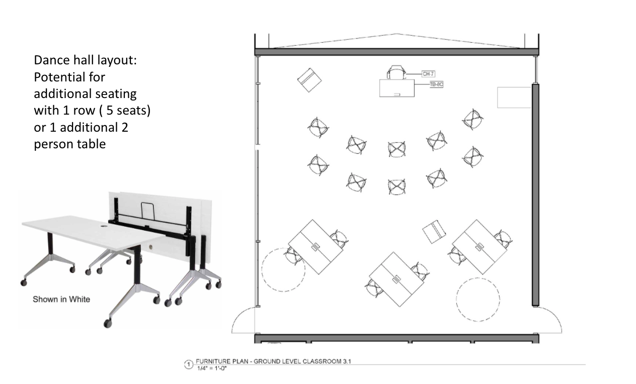
The second option is what we call our Dance Hall layout, including an initial capacity of 16 and the potential to add additional seating to push the capacity up to 21. By taking some existing stack seating in combination with the tables already in the space, we develop a simple set-up that leverages different learning styles and accommodates some flexibility into the structure of the classroom:
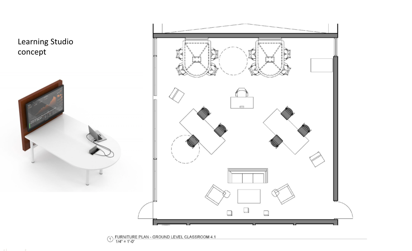
The third option we wanted to highlight is a little more nuanced, but may be a source of inspiration for your context. We considered the possibility that some of the library study rooms may need to close down to prevent too many people from being in them at once. So in this concept, we bring in some of the AV tables from those rooms to create a Learning Studio concept that could function as a computer lab, a study room, and a lounge area using the furniture displaced after cutting capacity in other places throughout the library. It’s an interesting scenario that utilizes the space available in a unique way:
KELLY: To speak generally about reworking spaces, here are a couple recommendations:
I would immediately visit with the HVAC systems engineer to discuss some of the ideas of increased air change. The Cruzen-Murray Library has an amazing system in its very backbone and the air is distributed through an accessible raised floor. This investment was so great because they can easily make adjustments with the controls at a minimal cost and take care of more air movement.
Also, I would recommend utilizing the ‘plug ‘n play’ technology within your furniture (like reader tables, individual study tables, and collaboration media tables) and move these to better configure them for social distancing. Utilizing the integrated cable management systems within the furniture will allow this to happen without any additional cost to you.
JOE: I agree with Kelly, and I would just add how important flexibility is right now in general. When you’re rethinking aspects of your space, whether it’s a study room, a classroom, or a computer lab, we’ve been seeing over and over again how crucial it is for us to structure in ways that allow us to adjust on the fly as the road ahead is slowly revealed.
This really is an opportunity for us to be creative about how our facility flows and functions to best meet the needs of the patrons we continue to serve.
As libraries are restructuring their spaces to support safe access for their communities, how can they maintain or introduce WELL design principles to enhance the health and wellness of patrons?
KELLY:
Materiality & Resiliency
The impact that our material choices have on resources and our economy has long influenced the choices we make as designers. In public institutions, we are sensitive to durability and maintainability as well as systems for human health. If we minimize the use of non-functional finishes which reduce first cost and maintenance cost and are easier to clean, this will help! Materials should be considered on the basis of resiliency — intended for high-use durability, health and wellness, flexibility, and a timeless aesthetic.
Set Goals & Prioritize WELLness
Integrated into any great design solution is a strong plan or process. I suggest holding a goal-setting session to establish the goals and what you believe is achievable for your library. Basic outcomes from many industries are available online to guide your process: Architectural materials, furniture layouts, specific WELL-building ideas, biophilic design, mechanical integration, HVAC upgrades, and a whole lot more.
We suggest creating your own manifesto that best fits your needs to provide for the people you serve. This may include both operational changes and policy changes in the way you provide service, but will give clarity on the direction you’re headed. Once you establish this manifesto, advise the public of specific strides you’re taking to make it a WELL environment.
(On a side note, I am an advocate for change in supporting the staff and their well-being. If the staff are happy and feel confident that the library is a WELL place to work, this will only develop into a positive outcome for the public.)
Flexible & Agile Space
As designers, our spaces need to be flexible and adaptive to a changing culture, adjusting requirements, and a variety of seating arrangements. Social distancing needs can easily be addressed when a space is designed to be flexible.
Context is crucial in this conversation, but we hope some of our thoughts and examples provided some fresh frameworks and ideas as you look at your own space.
Want to keep exploring this topic? Here are a few resources to continue on with:
- [Webinar] How to use “WELL” Design Principles to Address Covid-19 and Create Healthier Libraries
- [Article] 4 Shifts Libraries Should Consider to Reopen (or Remain Open) Effectively


