In this final installment of the Designing for Human Behavior blog series, we tackle the most discussed design element – Aesthetics. They aren’t a human behavior, but aesthetics are the glue that holds everything together. Without aesthetics, everything you’ve worked towards falls apart. Truly great design balances functionally, durability and aesthetics all in one, and while not every design will live up to this task, each design should begin with goal of achieving true balance.
To illustrate the crucial role of aesthetics in library design, we’ll use the analogy of how an airplane flies. An airplane flies on two principles, the first being Bernoulli’s Principle. Bernoulli’s Principle states that when the low pressure on the top of the wing to interacts with the high pressure under the wing, the plane lifts into the air and onto its destination. Simple enough, right? This principle brings back memories of high school physics class, but one detail was left out: the importance of air molecules.
The presence of air molecules only accounts for 10% of the reason why the plane can fly, but their importance is a much larger part of the equation. Without the air molecules the plane could never leave the ground. Both the air pressure and air molecules need to be present if we are going to soar to new heights. Aesthetics work in the same way as air molecules; While they might only be 10% of the equation, the final result cannot be achieved with them.
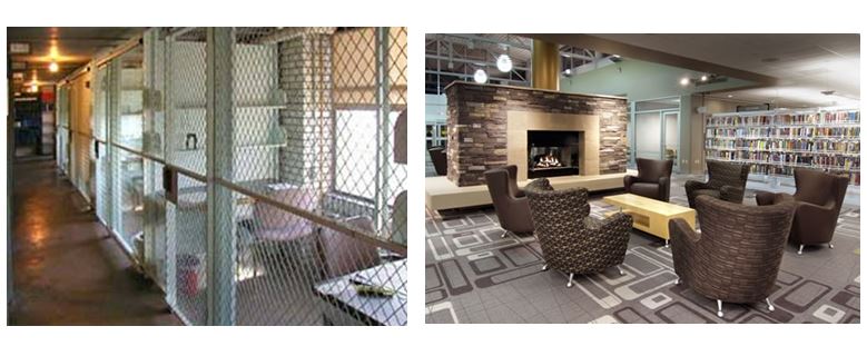
If you look at the work areas shown above, they both provide areas for people to sit and work with adequate space. Obviously, the one on the right is way more inviting and makes us feel more comfortable. Now, this is an extreme example, but it illustrates the idea that while these are both the right product for the work pattern and both appear to be durable, aesthetics, or the lack thereof, are the final 10% that can make a break the interior of a library.
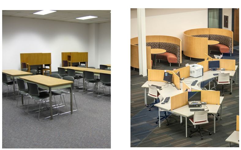
Now, this example shown above is a little less extreme. Both spaces have group and single work areas, and they include the appropriate furniture for the given activity. The difference here, though, is the room on the right applies appealing aesthetics, making the room inviting and conducive to work.
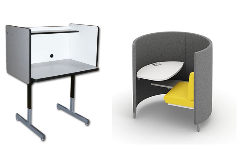
Let’s discuss the products shown above. Both have work surfaces for people to work on and provide a sense of privacy, but the product on the right creates feelings of comfort, warmth, and security (haven), allowing you to concentrate on your tasks.
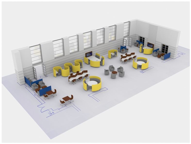
We’ll leave you with is the concept of Balance. Much like everyday life, everything comes down to balance. The need to balance aesthetics into library design, as well as the need to bring balance to the room as a whole. When designing your next library space, consider how to balance different work patterns and patron behaviors. Too much of a good thing is just that – too much, unnecessary, and an inconvenience to patrons. A library that solely provides zig zag tables in their space, or all PODs, or banquette seating, can be doing more harm than good to individuals coming to the library. There are countless different work patterns, and they deserve to be served with a balanced library space containing a variety of products and designs.
We hope you’ve enjoyed reading our Designing for Human Behavior series, and we look forward to chatting more with you about the ever-evolving public spaces we all work in. Want to keep up with Agati? Subscribe below.


